SUSE
Rebranding an icon
SUSE is a leading open-source software company that's been in the industry for over 28 years. In 2020, the Brand team that I was part of at Deloitte Digital developed a comprehensive rebrand. The aim was to help SUSE claim a distinct territory in the industry while staying true to its true identity and heritage.
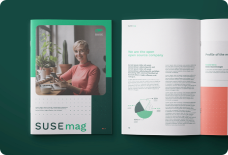
Since 2020, the brand guidelines we created have been successfully implemented in SUSE's website, print media, fairs and events, and even an ad that was displayed on Times Square.
Team
Deloitte Digital
Creative Direction
Allisa Hellwege
Design
Manuel Schwedt, Linda Einhoff, Charlx Alemañy, Joana Correira, India Armstrong, Amelia Román Mikkilä
My role
Exploration and definition of the design routes
Significant role in the logo redesign, the icon style, and the UI Styleguide
Strategy
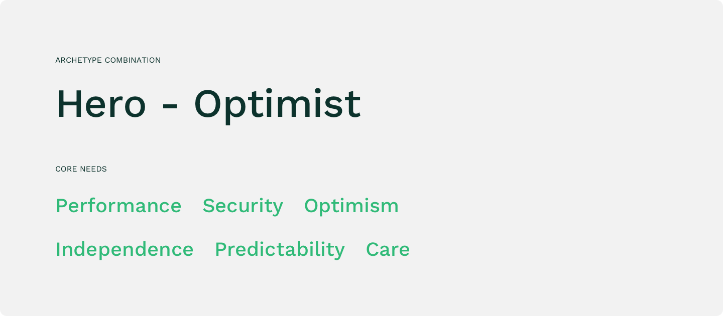
It all started with defining the strategy. After studying the audience and industry and having a productive workshop with the client, the strategists shaped the strategic foundation for the design. The new SUSE should be perceived as the archetype combination of Hero-Optimist. The 6 guiding needs of our customers, partners and communities were chosen. The archetypes and needs became our guiding start when developing the brand identity.
Design routes
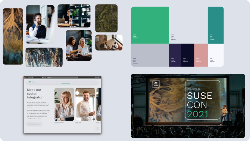
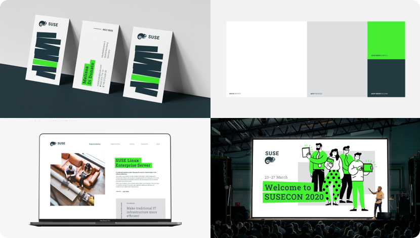
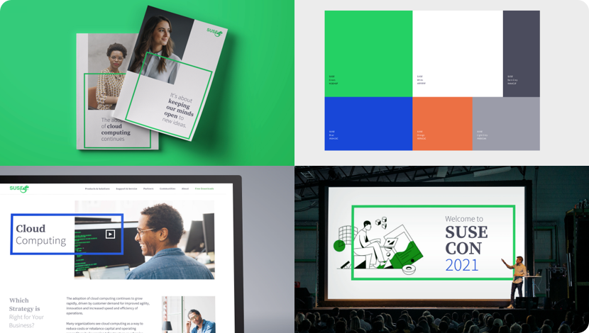
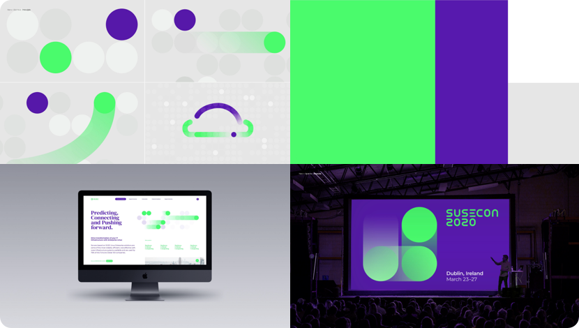
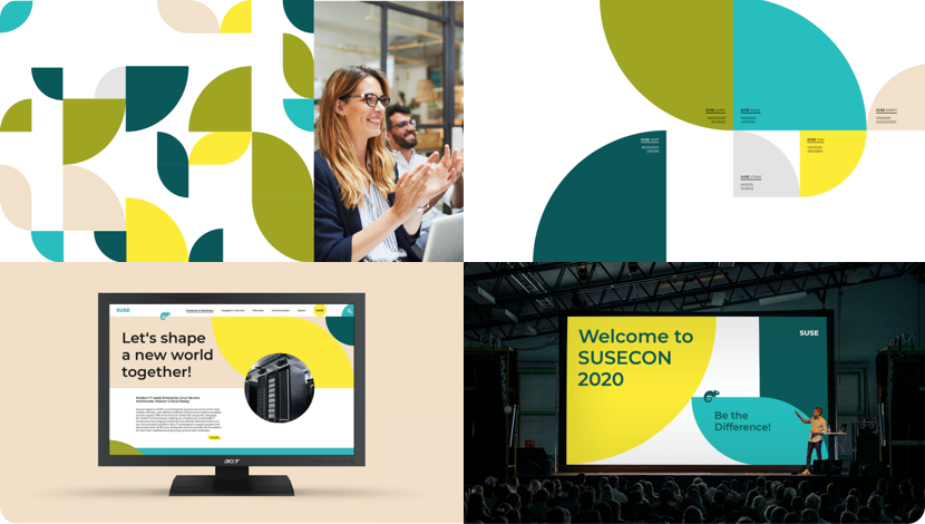
With a clear strategy in mind, a team of 8 designers came up with 6 different design routes in line with the archetypes and core needs.
This stage is crucial to help the client understand what they're looking for and make sure the visuals truly match the brand. By developing alternatives that we can identify what represents the new SUSE best.
The final design route combined the strengths of two of these initially suggested routes (number 1 and 4).
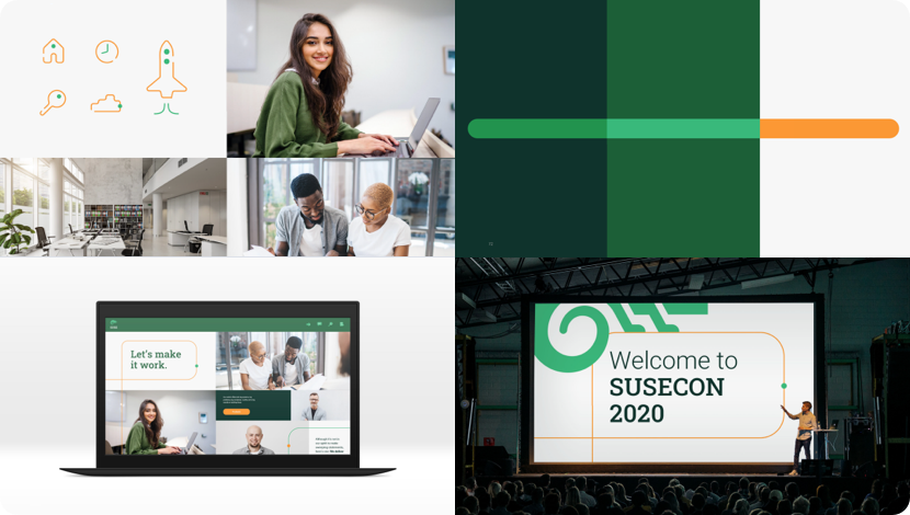
Final route
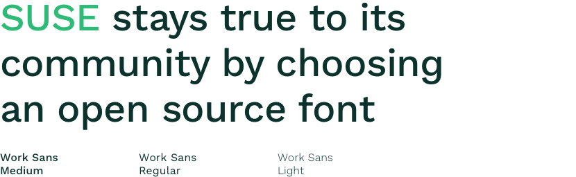
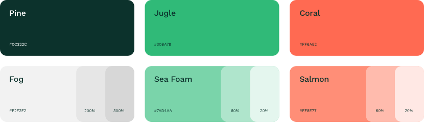
Typography
Colors
Key visuals
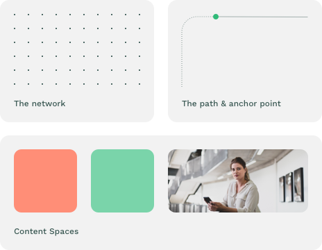
Imagery

Layout system
Illustration

Icon style
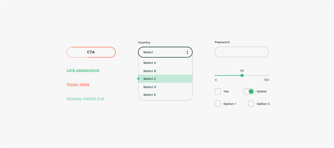
UI Elements
Web icons
Logo redesign
The new brand needed a new logo. But it was important for both the client and us to stay true to their heritage and keep their legendary chameleon, which is very much loved by their community.
We sketched dozens of versions and picked three finalists to go under neuroscientific testing. The Deloitte Neuroscience Institute performed an ITA (implicit test of associations) to understand what people subconsciously associate them with.
We were happy to find out that the version closest to the original logo had ranked the highest and that people associated it with words that represent SUSE.
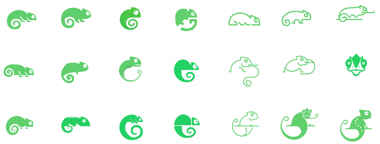
Finalist logos
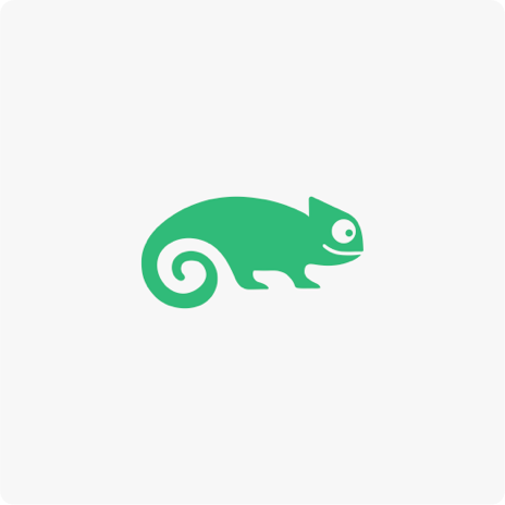
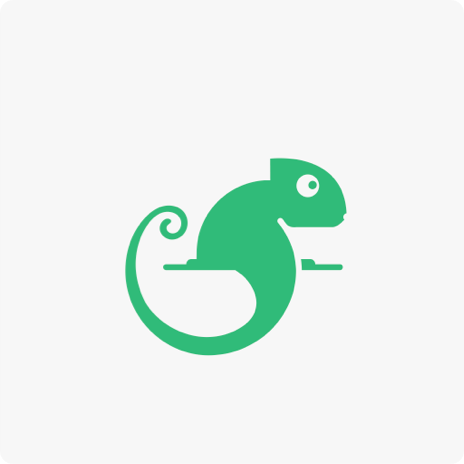
Previous and final logo
Launch video
Behind the scenes
All rights reserved. Deloitte Digital Germany 2019 - 2020